The Ultimate Guide to 2020’s Colors of the Year
Vibrant hues from four major paint brands that mark the beginning of a new decade of color.
We’re toasting the new year with our ultimate guide to 2020’s colors of the year. Read on to see the vibrant selection of hues from four major paint brands that mark the beginning of a new decade of color.
Sherwin-Williams
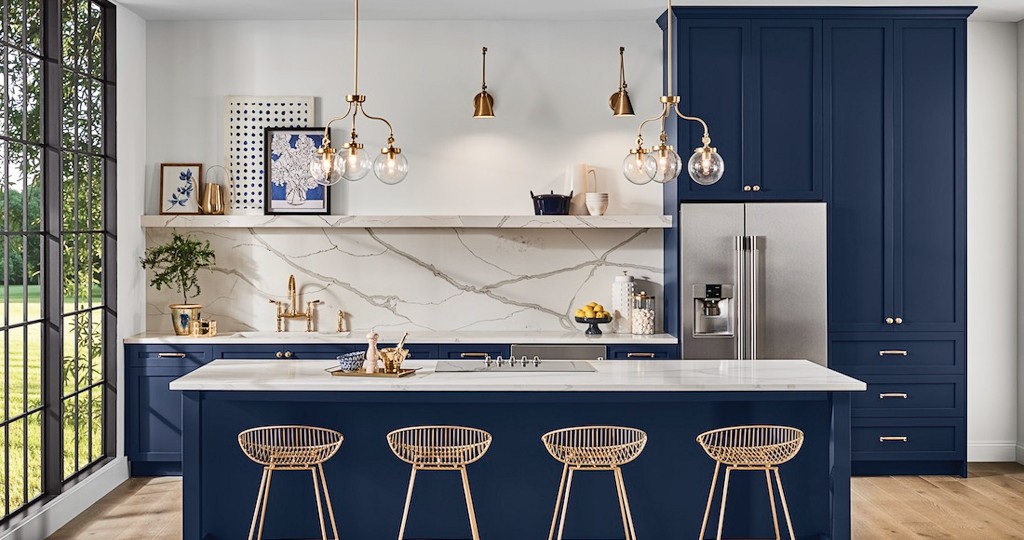
Inspired by the roaring ’20s and dreamy night sky, Naval (featured above) was announced as Sherwin-Williams’ 2020 Color of the Year. This rich blue hue exudes relaxation and poise.
“The use of color in interior design is changing. It’s not just about what a space looks like anymore, but how it makes you feel,” says Sue Wadden, director of color marketing at Sherwin-Williams. “People want to feel grounded and inspired to pursue their mental, physical and emotional well-being. Naval is reminiscent of the night sky, which people have looked to for centuries for guidance, as a muse and as a reminder to live more mindfully.”
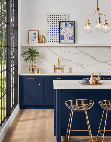
Photo: Courtesy of Sherwin-Williams
Best paired with luxurious finishes, Naval is actually very versatile to use in your abode. It can be in a traditional or coastal setting, or even be boho or contemporary.
“Pair Naval with natural materials, such as warm leather tones, vibrant greenery and woven fiber rugs, to create a calming oasis in your home,” recommends Wadden. “Furniture and décor can be mixed and layered to build a look as minimalist or maximalist as you like.”
Go to your local Sherwin-Williams for more information.
Valspar
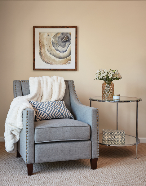
and pillows for a warm, homey feeling.
Photo: Courtesy Valspar
Valspar continues to go above and beyond with not one, but 12 selected hues for its 2020 Colors of the Year. These nature-inspired hues are meant to bring the serene outdoors in and allow everyone, from do-it-yourselfers to experts, a chance to expand their creativity and find the right shade for their home.
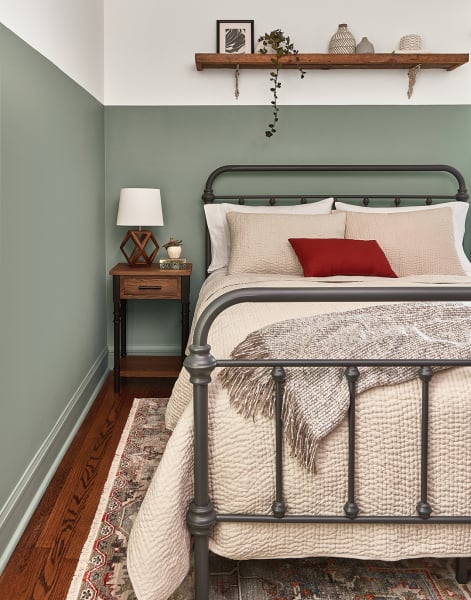
Photo: Courtesy Valspar
“Earth’s prescription for the chaotic, busy lives we all live is to bring the tranquility of nature and the outdoor world into the home. That’s exactly what we set out to accomplish when forecasting the 2020 Colors of the Year,” says Sue Kim, Valspar’s color marketing manager at Sherwin-Williams.
a cozy scene within this dining room.
Photo: Courtesy Valspar
You’ll surely want to fill your whole home with these “livable neutrals.” Pick up Valspar paints at your local Hardware Hawaii.
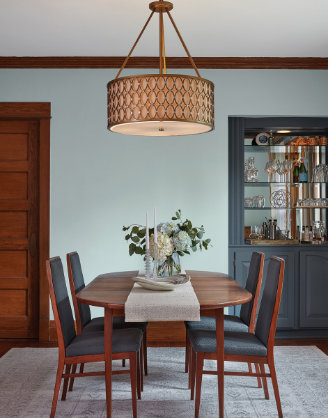
Benjamin Moore
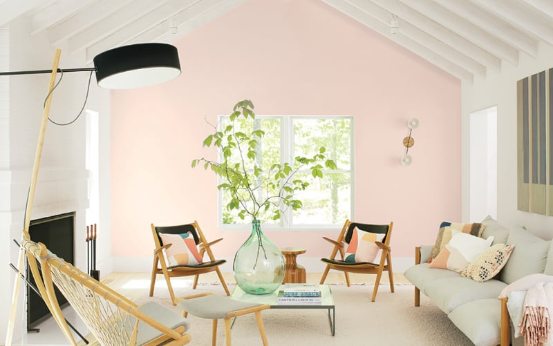
Photo: Courtesy of Benjamin Moore
It’s the dawn of a new beginning of colors — and Benjamin Moore is serving us a color that represents potential, idealism and a fresh start to a new year and decade of color. First Light is an uplifting rosy hue that features both warm and cool tones.
“First Light 2102-70 reflects a new definition of the home – a shift in mindset from the material to satisfying the core needs in life: community, comfort, security, self-expression, authenticity and ultimately, optimism,” says Andrea Magno, director of color marketing and development for Benjamin Moore.
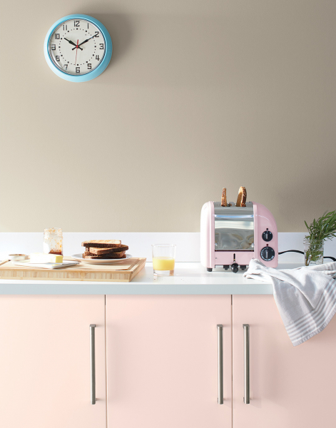
Photo: Courtesy Benjamin Moore
First Light will brighten up the room, so think of adding a splash of it in your living room or kitchen. Along with its 2020 Color of the Year, Benjamin Moore announced its Color Trends 2020 palette, a collection of 10 harmonious hues.
Find Benjamin Moore paints at your local City Mill or select HPM Building Supply stores.
PPG Paints
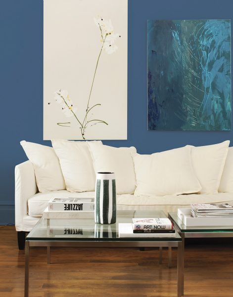
Photo: Courtesy of PPG Paints
PPG Paints sought out a color that would offer an escape from today’s fast-paced society, selecting Chinese Porcelain, which blends cobalt and moody ink blue to offer a spirit of hopefulness in the world.
“The faster technology moves and the more convenience it offers, the more we seek activities, experiences and lifestyles that impart slowness and realness into our lives,” shares Dee Schlotter, senior color manager of PPG paint brand.
Chinese Porcelain fits in perfectly here as consumers are craving blues that bring us closer to natural elements like the sea and sky, adds Schlotter.
The color can be the perfect backdrop to make others pop, but also act as a feature color, like in a bedroom with white bedding. For a living room look, you can layer additional blues or bring on metallic finishes.
Schlotter recommends pairing Chinese Porcelain with lush velvet décor in warm saffron and turmeric tones, or with leather accents and dusty sand tones.
See this color and more at your local PPG Paints store.