Take a Dive into Living Coral, Pantone’s 2019 Color of the Year
The shade brings color excitement to a variety of interior spaces.
The wave of earthy, natural tones for 2019 continues on as Pantone releases its highly anticipated color of the year: Living Coral — a bright burst of color that’s found under the sea, right in nature.
Described as “an animating and life-affirming shade of orange with a golden undertone,” Pantone 16-1546 Living Coral is all about connection. “Color is an equalizing lens through which we experience our natural and digital realities and this is particularly true for Living Coral,” says Leatrice Eiseman of the Pantone Color Institute. “With consumers craving human interaction and social connection, the humanizing and heartening qualities displayed by the convivial Pantone Living Coral hit a responsive chord.”
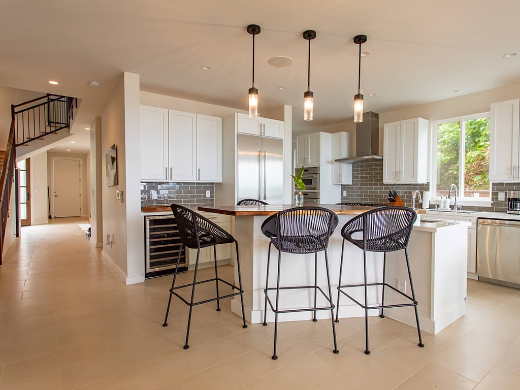
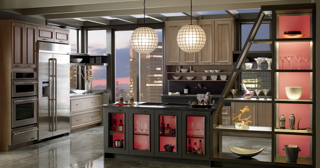
In the kitchen, where we often spend the most time connecting with our family, this color can play a part in enhancing the heart of the home with loud accents against cabinetry or on the wall, as well as adding warmth to the room through décor and furnishings.
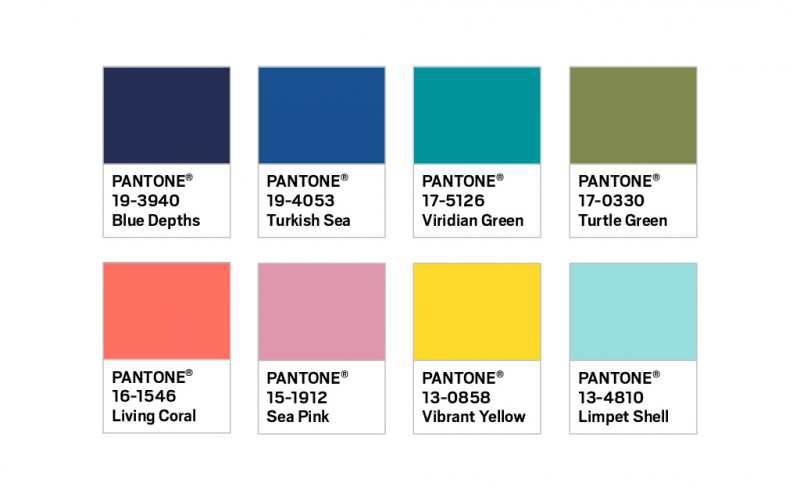
Image: Courtesy Pantone
Incorporate splashes of Living Coral with Omega Cabinetry, a brand of MasterBrand Cabinets available locally at Homeowners Design Center. The fully customizable line allows you to add color and inserts of your choosing. What’s more, the cabinetry line comes framed, frameless and semi-custom, allowing you to mix and match, shares Randall Omoto of Homeowners Design Center. It’s all about your personal preference.
“Living Coral is one of the most perfect recent Pantone colors of the year. Its relevance in home interiors, particularly kitchens, is something that breathes life into, and brings color excitement back to this space,” shares Stephanie Pierce of MasterBrand Cabinets.
“We have started to see a rise of personal color preferences making their way back into cabinetry as accent areas, small appliances and décor, and this is a very useable color tone, especially as we will likely see variations of this shade with even more intensity or as drop downs in a paler range.”