Pantone’s 2020 Color of the Year Makes a Return to the Classics
Classic Blue, an elegant and calming hue, is a confident way to start the new decade.
Pantone is making a return to a timeless “classic” with its 2020 Color of the Year. Classic Blue, an elegant and calming hue, brings about peace and tranquility in its simplicity. A fitting and confident way to start off a brand-new year and decade.
“We are living in a time that requires trust and faith. It is this kind of constancy and confidence that is expressed by PANTONE 19-4052 Classic Blue, a solid and dependable blue hue we can always rely on,” shares Leatrice Eiseman, executive director of the Pantone Color Institute.
In home interiors, Classic Blue offers a boost of creative confidence and is “easily applied across so many different materials, textures and finishes,” according to Pantone.
“It is definitely a classic color,” and one that can be used year-round, says Maui-based Dee Dee Ackerman, president of the Hawaii chapter of the American Society of Interior Designers and owner of DL Ackerman Design Group.
Design by Emily Henderson; Photo: Sara Tramp
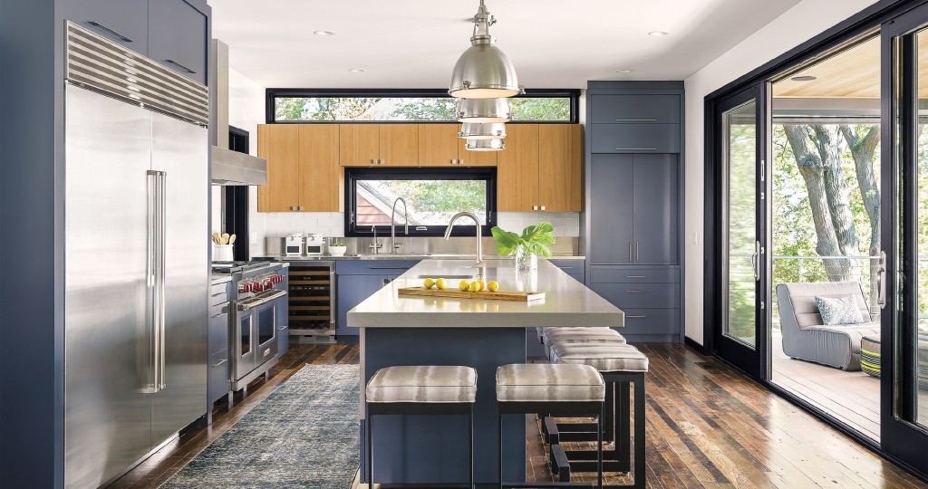
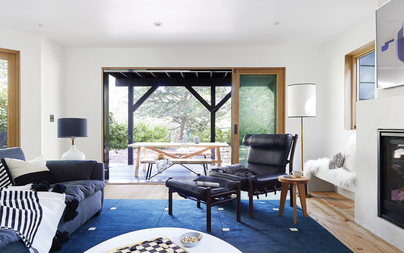
You can embrace this rich tone in your home in a variety of ways — on your walls, in your accent pieces and cabinetry, even on your front door — shares Ackerman. “It’s a universal color; it goes with virtually anything,” she adds. “You can use it boldly, like painting a room, or you can just do accessories in that color.”
And with the right framework for your home, you can enhance this color to its fullest potential. Consider pairing Marvin windows and doors in a darker finish to make Classic Blue pop within your home.
“Marvin is an excellent brand. They pay close attention to the needs of both the architects designing the home as well as the homeowners,” says Chris Ayres of Pacific Source. “Their goal is to imagine and create better ways of living. This focus on lifestyle has led to a product line that can meet the needs of many applications and styles.”
Marvin products can highlight the beauty and nuances of any design, shares Ayres, from slim sightlines for a modern contemporary feel to the detailed woodworking of a craftsman-style home.
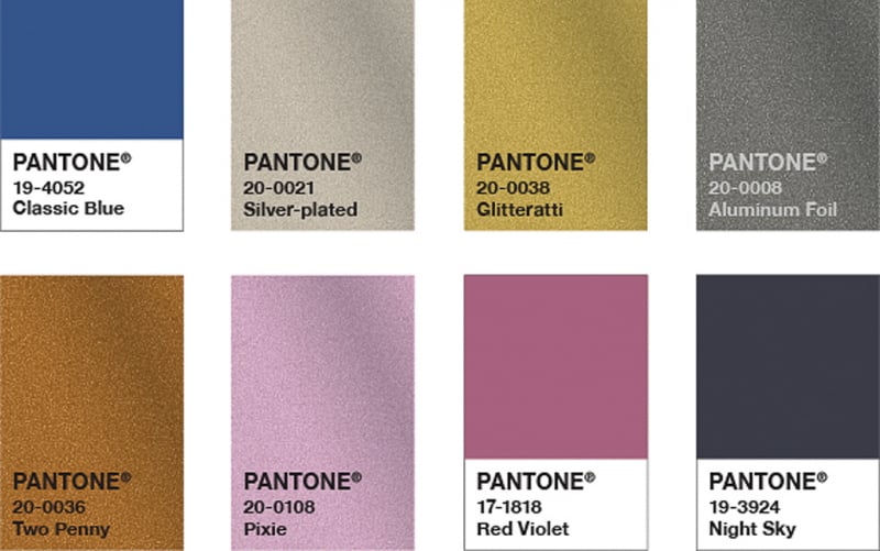
Photo: Courtesy of Pantone
“Deep blue tones like Pantone’s Classic Blue are timeless colors that offer homeowners flexibility from a design perspective. Homeowners are interested in flexing their creativity by cultivating spaces that are thoughtfully designed to evoke certain feelings or emotions,” says Jackie Schneider, vice president of marketing at Marvin. “Deep blues can be used as both beautiful, grounding accent colors or even as a dominant color in a room for a bolder statement, like theater rooms, living rooms or smaller powder rooms.”
Learn more about Pantone’s multisensory color at pantone.com, and find Marvin products locally at Pacific Source.